
TEXTILE | FASHION
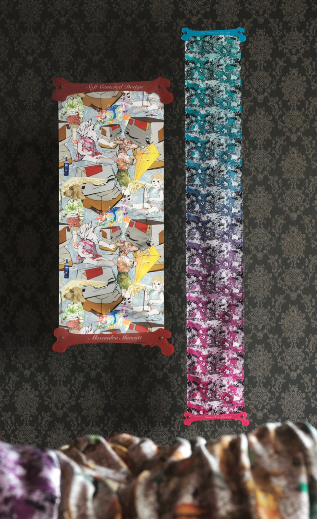
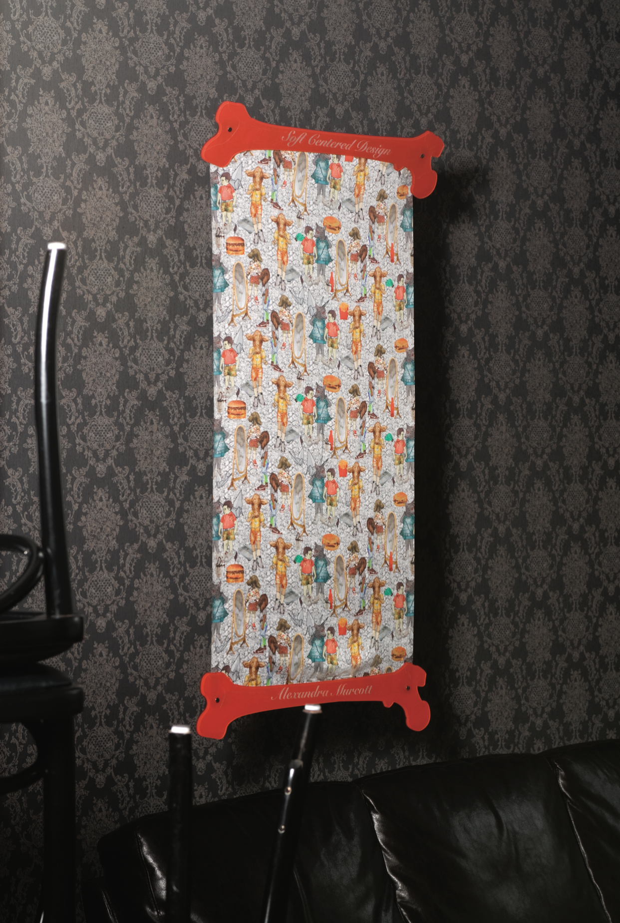
'Vulture Kisses', was a provocative, controversial and affronting collection of fabrics and garments which opposed sensitive and uncomfortable aspects of modern living and the human psyche against what we consider alluring and acceptable. Moxham's intention was to open dialogue about the influx in advertising and it's impact on society. She questioned the practise of our assessments of healthy and diseased, superficial or significant, good and bad; what is acceptable and what is perceived as inappropriate.
Objectionable paraphernalia and contentious acts were illustrated and presented on textiles which were crafted into striking one-of-a-kind fashion garments and totes; completely against the convention of what had previously been considered appropriate for textile yardage prints to that date. These designs created in 2006 pre-cursed a trend to showcase the gross with the gorgeous that would sweep through the textile and fashion worlds globally in 2008.


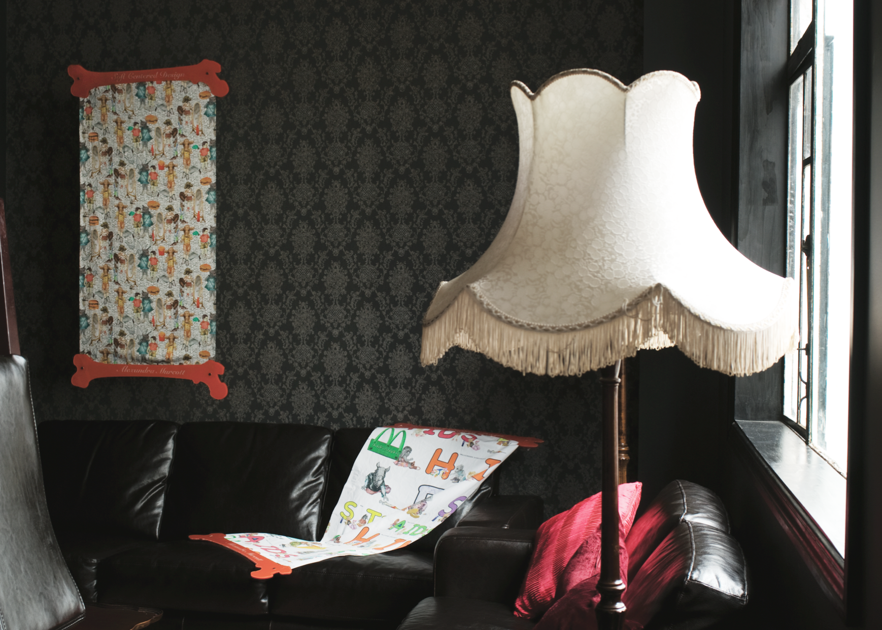
Naïve patterns littered with adult themes played hide-and-go-seek with the viewer. Age and knowledge playing a huge role in what level of perception or enjoyment the observer received from the motifs and designs. The imagery provoked the audience to consider how their life experiences related to their interpretation of different themes- the alphabet design in particular was filled with confronting and controversial arrangements of letters, it's inspiration built from childhood alphabet posters, was created to be intentionally antagonistic.
Moxham encouraged children and adults to pick up a felt-tip pen and colour in letters that had been left absent of tone. Kids freely enjoyed and engaged with this process, but adults less so, being conflicted and offended by the imagery. What is bad, what is sick, what is fun, what is pretty, what is risqué asks Moxham; to recognise or to dismiss, to override preconceptions, to participate or not, to agree or take issue with were bones of contention raised within the designs; all having validity irrespective of negative or positive disposition.
Moxham did not intend the audience to have to like, enjoy or agree with her work; did this make it less valid; was it fashion, or just lewd? was it wrong or right and did it need to be either? Human conditions; components, elements, materials and depictions of activities from the real world were illustrated, but became infinitely more confronting when mixed with youth, animals; that which we consider pure and untainted. Moxham made engaging things from not nice stuff, having the courage to say ‘this is human beauty in all it’s complexity’. She purposely needled concepts of age with stigmas and behaviour; children haven't been conditioned to see what adults take offence to, what is valid about doing this as an adult? she asks.
Hours of investment into creating the illustrations, patterns for the garments, printing, embellishing, construction and presentation where the imagery dealt with themes of disorder, conflict, addiction, consumerism, debauchery, disease, disesteem and societies underbelly provoked the observer to consider what is beautiful and what is valuable. ‘I am beautiful and valuable’ Moxham said through the work, ‘but I am raw, real and flawed within this’.
Traditional v contemporary was a theme reflected through processes, iconography and construction. Sketching, collage, drawing, photography, pattern making (of garment and motif), embroidery and direct appliqué was mixed with computer artistry, large format digital fabric printing and synthetic materials. Digital textile printing at that time being cutting edge new technology. Traditional craft enhancements juxtaposed the sterile and impersonal nature of digital production- following the theme of old mixed with new.
Renaissance and classical symbolism was incorporated with modern iconography and product placements which assaulted the viewer with layers of complex information as if slammed into an acid trip on Halloween in Shibuya. Themes of good and bad, symbolic and literal, naughty and nice; posed more questions than answers and hung unresolved and open for interpretation. The work was playful yet unabashedly spicy; a reflection of Moxham, of life and of modern culture.
‘Vulture Kisses’ is a marker within Moxham’s artistic development and a signpost from where she continued to explore themes of juxtaposition, the nature of humanity and herself, psyche and yin | yang.
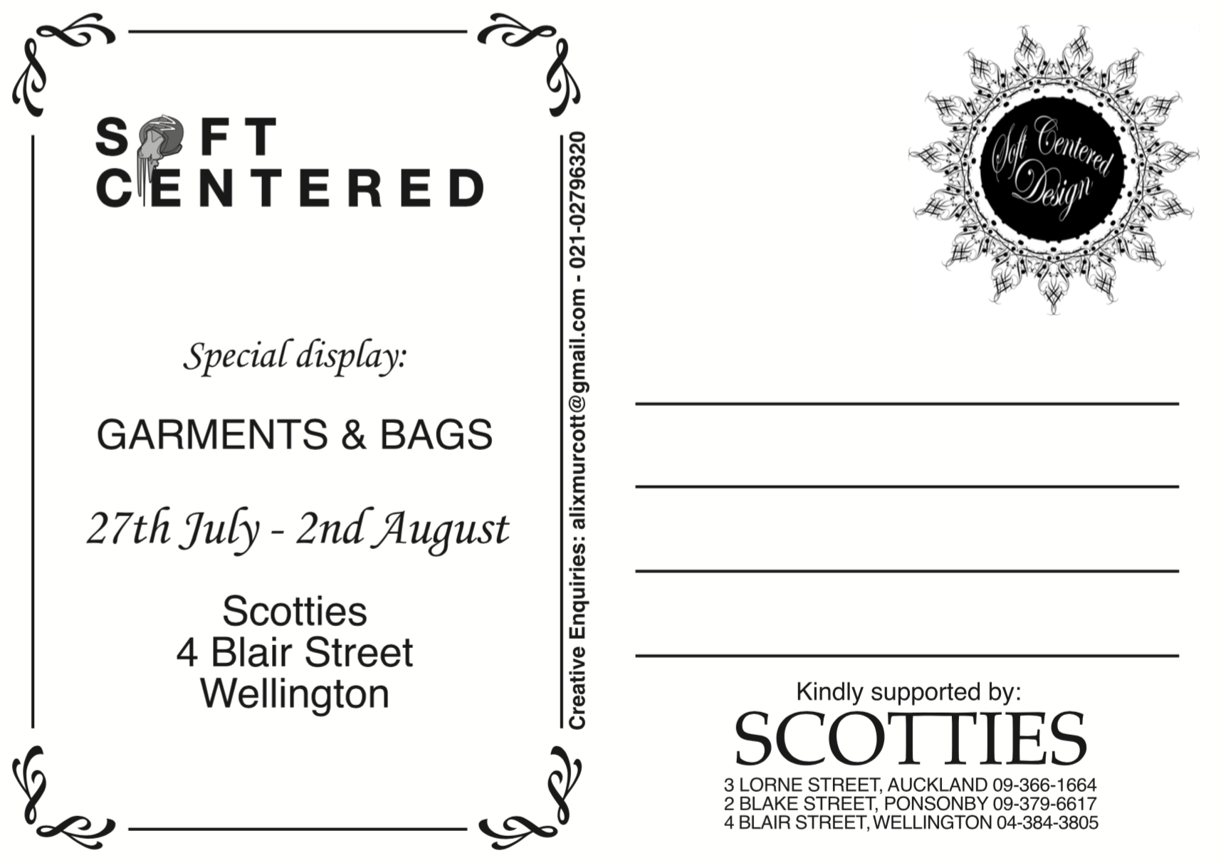
The collection titled as 'Soft Centered' was exhibited at the exclusive New Zealand couture fashion boutique- Scotties in 2009 alongside garments of exceptional calibre such as Dries Van Noten, Lanvin, Comme des Garçons, Haider Ackermann, Celine and Issey Miyake.
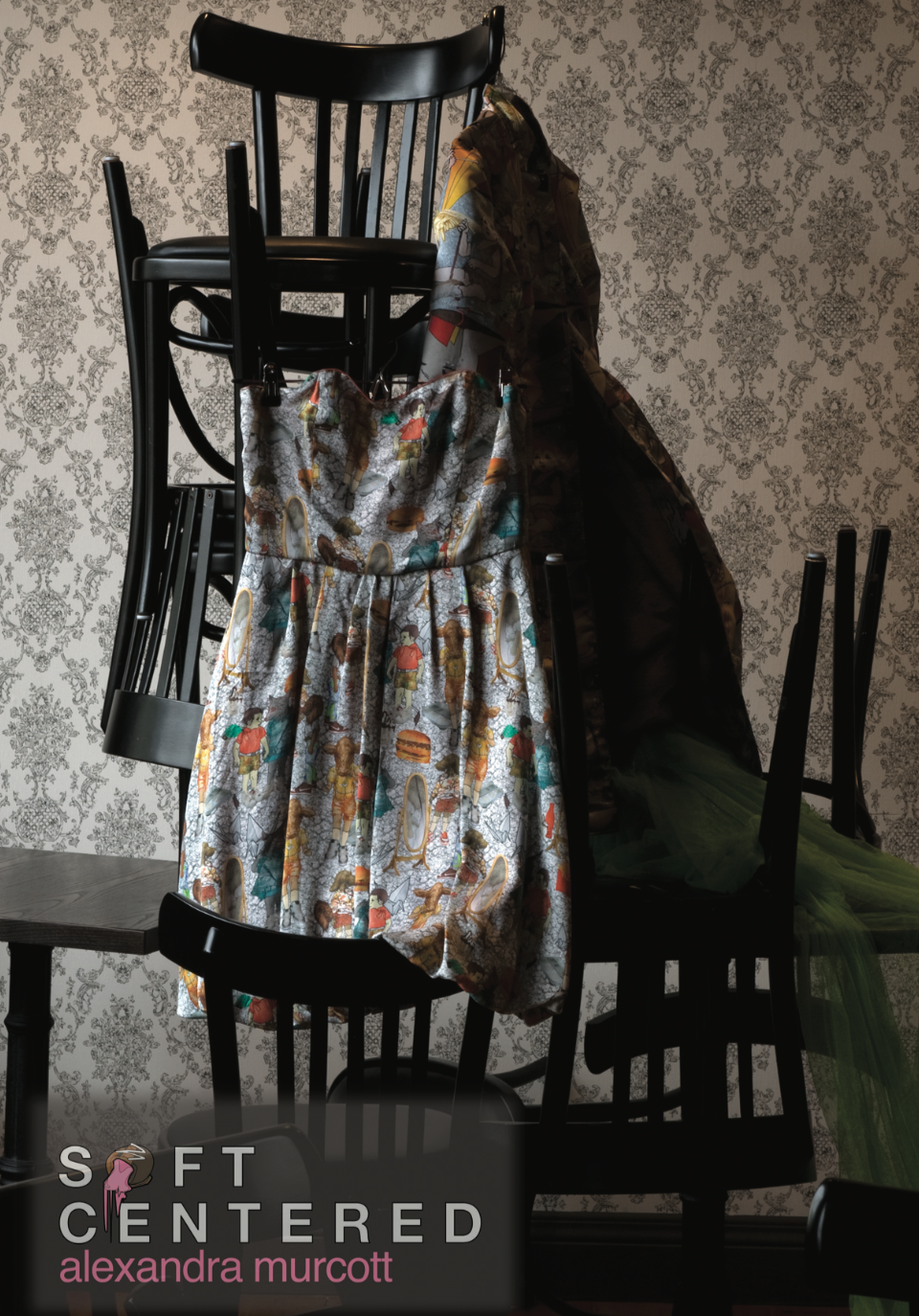
Photography by Helen Mitchell
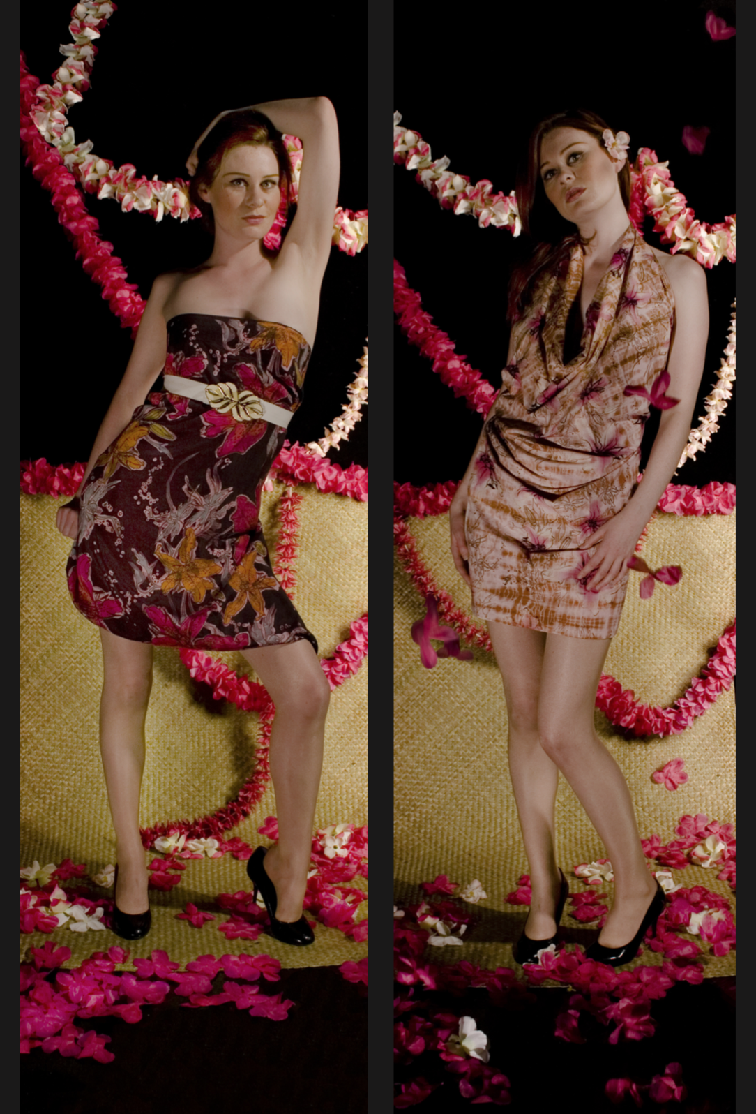
'Pacific Pallate' were two art yardage textiles which combined Pacific iconography, Asian textile techniques and contemporary hues. Traditional dying techniques such as Shibori (Japan) and Batik (Indonesia) were used to create texture, pattern and depth within the designs. Modern techniques such as screen-printing and bleaching had been combined with the former traditional techniques to create motifs and arrangements which had a modern twist yet informed by tradition. Direct dye application (wet & dry), long bath dying and dye dusting created additional depth to the designs and the intricate final results.


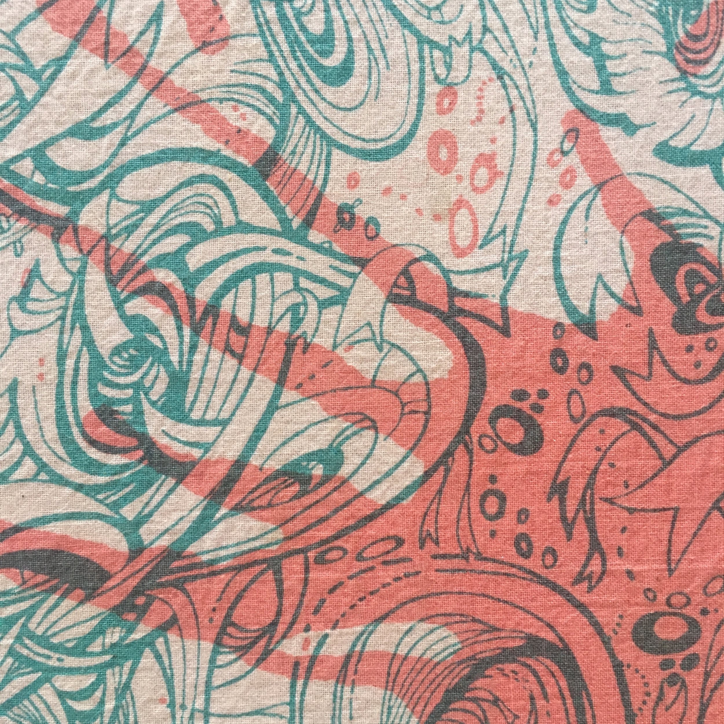
'Don't Cry Over Spilt Paint'
Large format two colour separation screen print onto Dupion silk, 2006.
Sold commercially as a t-shirt placement print.


'Life Is An Aquarium' Sublimat printed satin halter top, 2007.
'Don't Cry Over Spilt Paint' Large format two colour separation screen print onto Dupion silk. Made into dress and bag, 2006.
'Keep Your Head in the Clouds' Screen printed t-shirt and props, 2007.
'The Creative Rat Race' Wallpaper drop and screen printed t-shirt design, 2006.
Model: Sarah Garlick | Photography: Anastasia Blades